QuickTix
A web app for finding sports events, choosing seats and booking tickets in one flow.
- Duration
- 3 months
- Research to developer handoff
- Role
- Product designer
- Team size
- 5 people
- 1 PM, 3 engineers, 1 designer
- Platform
- Web app
- Industry
- Sports ticketing
- Location
- Remote
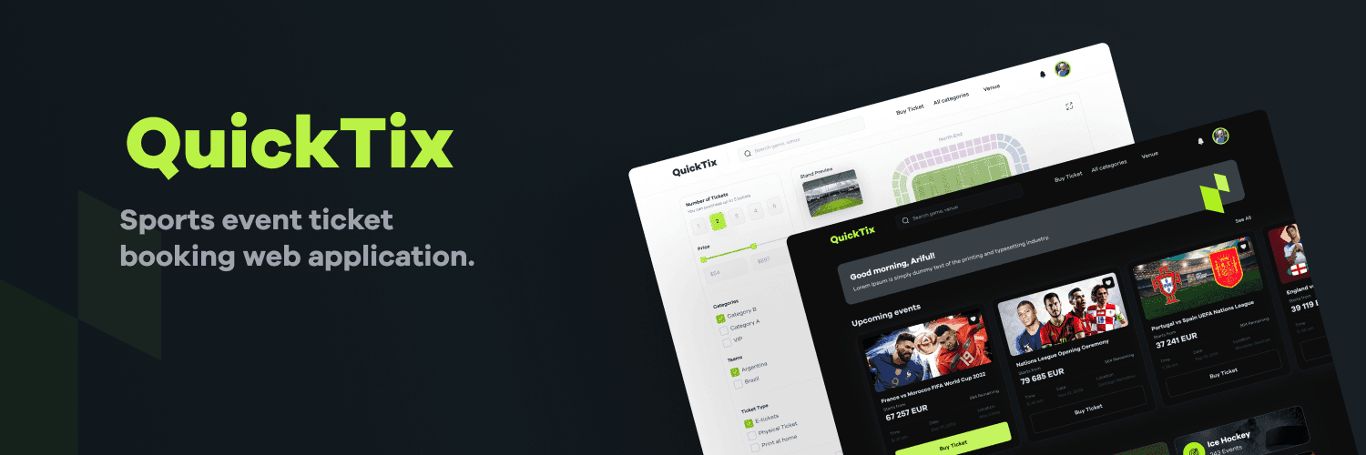
Results & impact.
Results after the redesigned booking flow went live.
- 32%Higher conversionVisits that end in a booking
- 50%Faster checkoutTime from seat to ticket
- 25%More offer uptakeVIP and early-bird bookings
- 3 stepsFind, choose, payFrom match to ticket
- 40%Fewer support requestsAbout booking problems
Where it started.
QuickTix is a ticket booking web app for sports fans. Fans found it hard to see which events were on near them, and booking a ticket was confusing and slow. The goal was one place to discover events, choose seats and pay, with live updates and offers built in.
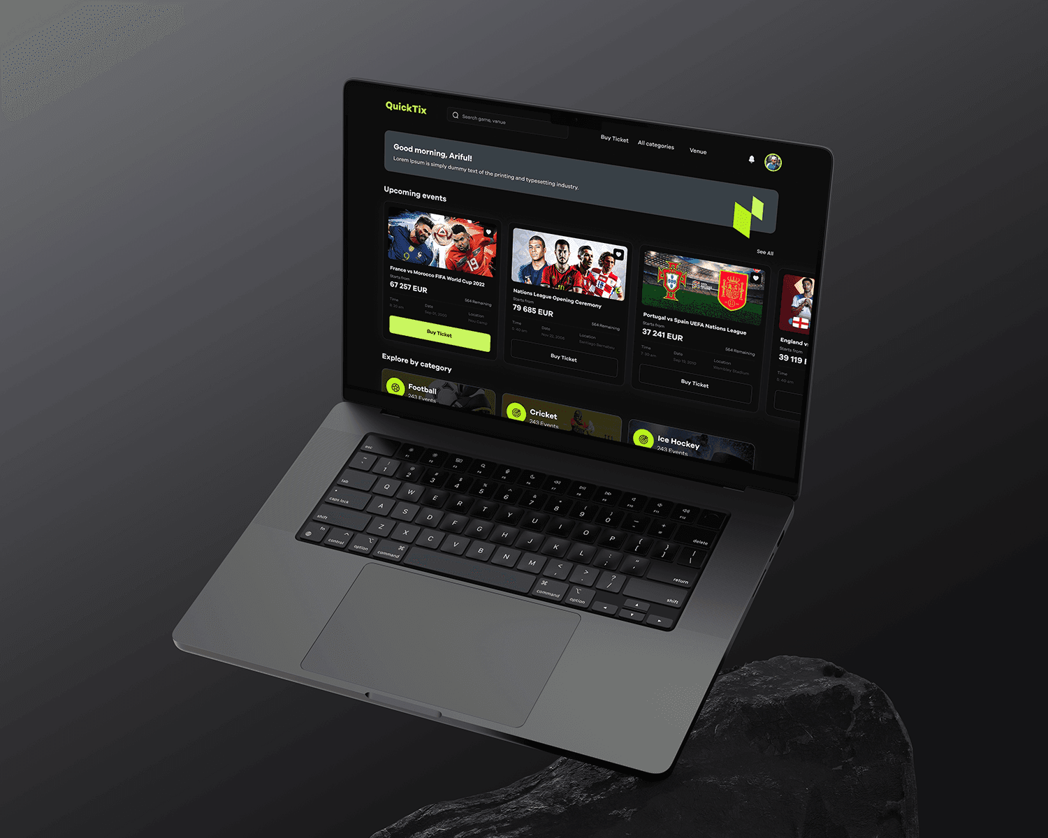
The core problem
Fans knew which match they wanted to see, but the site made them work to find it, judge their seats and get through checkout.
- 01
Events are hard to find
Fans struggled to find information about sports events near them.
- 02
Booking is confusing
The ticket booking process was confusing and took too long.
- 03
Offers are easy to miss
Fans missed out on exclusive offers because they weren't part of booking.
Business goals
- 01
Faster event discovery
Help fans find matches near them in seconds
- 02
Simpler booking
Cut the steps between choosing a seat and paying
- 03
Higher offer uptake
Put VIP and early-bird offers where fans choose seats
- 04
Fewer abandoned checkouts
Keep fans confident about what they are buying
Research & insights.
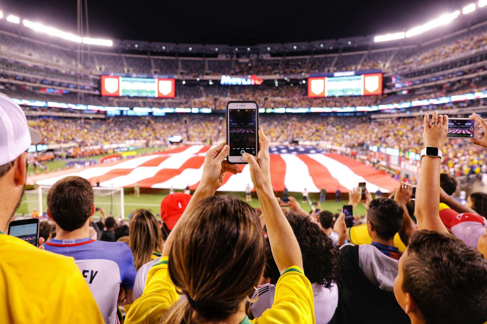
We spoke with regular match-goers, reviewed popular ticketing sites, and watched fans try to book a ticket from start to finish.

- 01
The seat is the decision
Fans chose a ticket by where they would sit, but most sites showed seats as a list of prices.
- 02
Doubt kills checkout
Fans abandoned payment when they couldn't see the match, date and seats they were paying for.
- 03
Offers go unseen
Promotions on a separate page were ignored; fans only noticed what was in the booking flow.
Design principles
We reframed the brief from "sell more tickets" to "how might choosing a seat feel as easy as pointing at it?"
Show the seat
A stadium map answers the main question before price comes up.
Keep the ticket in view
The ticket summary stays beside the payment form, so fans always know what they are buying.
Offers in the flow
VIP seats and discounts appear where fans choose, not on a separate page.
How the design evolved.
The work ran in five phases, each building on what the last one found.
- 01
Research
Reviewed the client's goals and existing ticketing sites
- 02
User flows
Mapped the path from finding a match to a paid ticket
- 03
Wireframes
Sketched discovery, seat selection and checkout in low fidelity
- 04
UI design and prototype
High-fidelity screens and a clickable booking prototype
- 05
Design system and handoff
Shared components and specs for the developers
From wireframes to final design
The first checkout split seat choice and payment across separate pages. Testing showed fans went back to check their seats before paying.
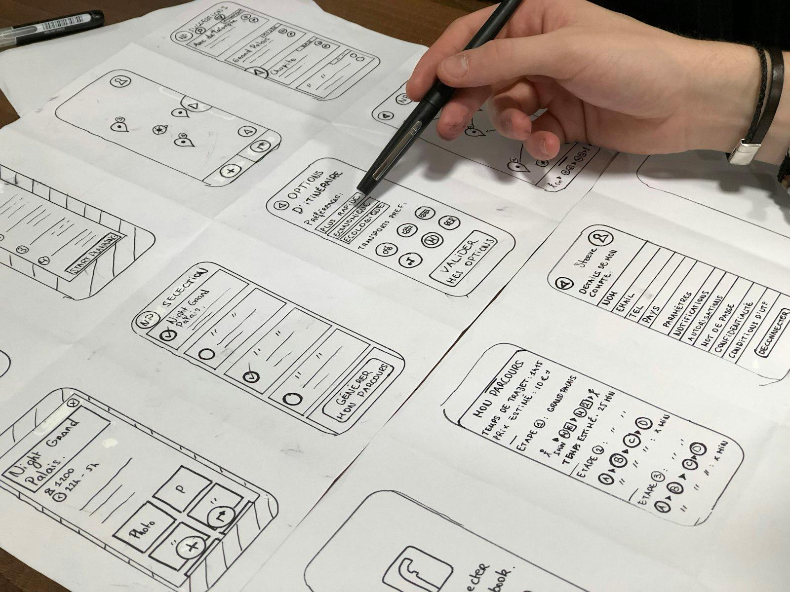
Issues found
- Seats shown as a list of prices
- Ticket details hidden at checkout
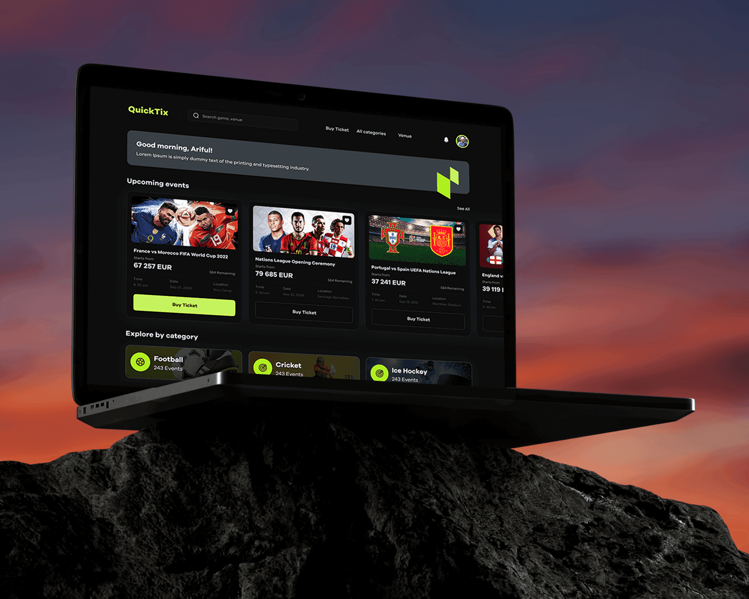
- Offers on their own page
Improvements
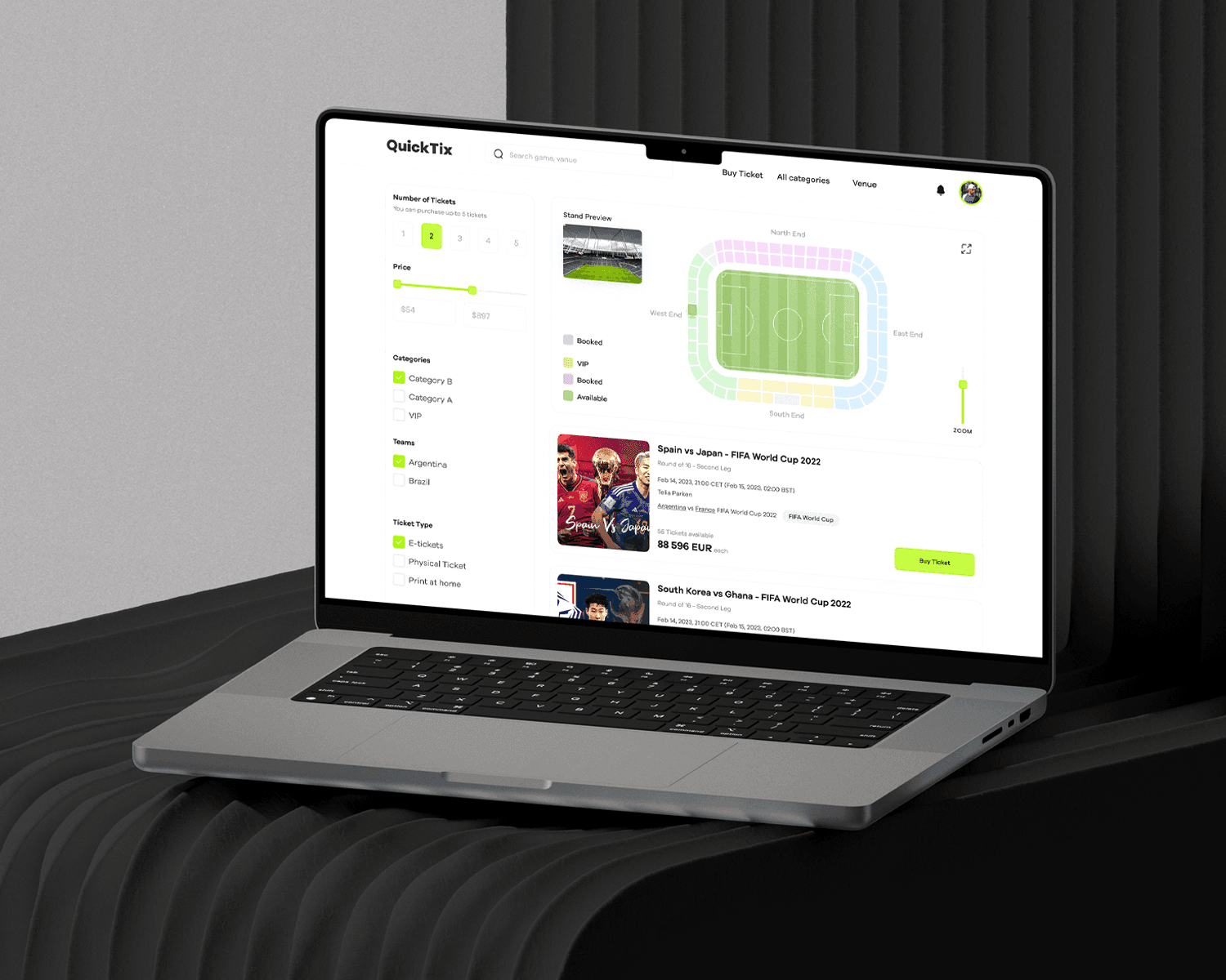
- Colour-coded stadium map
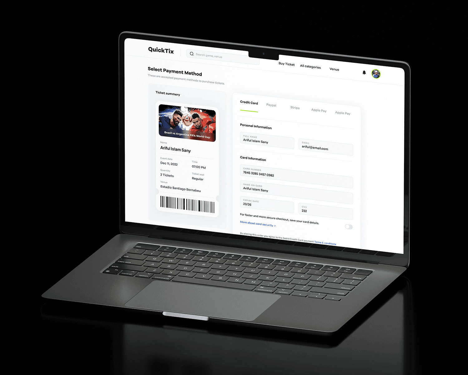
- Ticket summary beside payment
- VIP and early-bird seats on the map
Final solution.
Each decision removes a step between finding a match and holding a ticket.
- Solution 01
Choose seats on a map of the stadium
Booking felt confusing, and the seat, the main thing a fan is choosing, was hard to judge. Seat selection happens on a map of the stadium, coloured by seat type and availability, next to filters for number of tickets, price, team and ticket type.
- Solution 02
Keep the ticket in view while paying
Checkout is where a slow, confusing booking flow loses people. The checkout shows a summary of the ticket (match, date, seats and venue) beside the payment form, with each payment method in its own tab, so fans can check what they're buying as they pay.
- Solution 03
Put offers where seats are chosen
Exclusive offers went unnoticed on their own page. VIP seating, early-bird discounts and event promotions appear inside the booking flow, so they're part of choosing a seat rather than a separate upsell.
Key features
Also in the app, alongside the three decisions above.
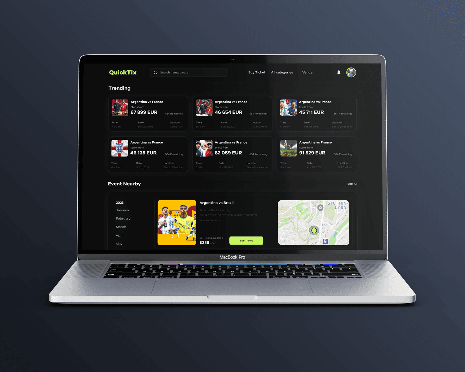
Nearby events
Trending matches and events near you, shown on a map.
How I used AI.
AI sped up research and content work; every decision was still checked by hand.
Research synthesis
Clustered usability-test notes into themes, then checked them against the recordings.
Realistic prototype content
Generated sample fixtures, venues and prices so prototypes looked like a real season.
Where I overruled it
It suggested a one-page checkout with everything at once. Testing showed fans preferred seat first, then payment, so I kept two clear steps.
What people said
“I can see exactly where I'll sit before I pay. No more guessing.”
“Booking for the whole family took two minutes.”
“I only found the VIP seats because they were right there on the map.”
What I learned.
- 01
In ticketing, the seat is the product
Showing it on a map answers the main question before price or payment comes up.
- 02
Offers work best where the decision happens
VIP seats on the stadium map are part of choosing, not an interruption.
- 03
Keep the purchase in view at the moment of payment
Doubt, not price, was what made fans leave.
- 04
Test the flow, not the screens
The problems only showed up when fans booked from start to finish.
What's next
- 01
Mobile tickets
Add tickets to the phone wallet for quick entry
- 02
Group booking
Let friends pick seats together and split the payment
- 03
Price alerts
Notify fans when seats for a match they follow drop in price
Let’s work together.
Hiring a design lead, or planning a product that needs one? Email me at arifulislamsunny@gmail.com or book a call.